Martin Sharp's 1967 Bob Dylan poster
Blowing in the Mind 1967 | Brett Whiteley | Don't Look Back 1967 | London 1962 | Masters of War

Martin Sharp, Blowing in the Mind - Mister Tambourine Man, Big O Posters, London, 1967. Offset lithograph in red and black ink on gold metallic-faced card, 20 x 30 inches.
Something in the air....
Martin Sharp's Blowing in the Mind is one of the most famous posters of the Sixties, selling over 100,000 copies between 1967-70 and the subject of more than 40 print runs by Big O Posters of London (Bigham 2001). A masterpiece of graphic design, printmaking and psychedelia, it encapsulates the swirling zeitgeist of swinging Sixties London, bringing together music, words, colour, drugs and youth culture in a stunning mix of red, black and gold. Impossible to categorise - Pop? Op? Psychedelic? - it is a generational time capsule, delivering more in a single viewing than a truckload of academic texts or hours of documentary viewing. As Sharp's friend and noted feminist Germaine Greer emphatically declared in 2009:
Want to know what the 60s were like? Then look at Martin Sharp’s work. .... Everybody who can remember anything about the 60s can remember Martin's poster of Dylan as Mr Tambourine Man, printed in red and black on gold paper (Greer, 2009).
One of the most pertinent comments regarding Sharp’s psychedelic art and works such as Blowing in the Mind comes from David Widgery, a fellow artist who worked with him on London OZ magazine. Widgery described Sharp’s portrait of Dylan as a ‘vision of psychedelia - clean and pure and dayglo. Rather than that muddy, tie-dyed t-shirt mixed up liquid-slide look. Sharp had wit’ (Green, 1999). Blowing in the Mind is uniquely the product of this Antipodean artist, yet also draws inspiration from Lichtenstein’s ZAP! POW!, Pollock’s Blue Poles, and Bob Dylan’s impenetrably dense lyrics and supreme cool. A quaint though powerful folk song - Blowing in the Wind - is transformed into the electro-psychedelic visual explosion of Blowing in the Mind. The work is now iconic - timeless, yet forever recalling a period when the words peace and love took on new meaning, They signaled a strident plea by the younger generation for a new way of living on planet earth and a deeper understanding of the people and places about them. During 2013 the Blowing in the Mind poster featured in the Great Refusal exhibition at the Hayward Gallery, Southbank, London. A video record of the exhibition features the poster and juxtaposes Sharp's graphics with the great Cold War fear of nuclear attack, though the beauty of Blowing in the Mind is the very antithesis of what the atomic bomb represented, and continues to represent, in the current era of War on Terror.
The Great Refusal at The Hayward Gallery Space from MRB on Vimeo. Video, 1 min 51 sec. Visual record of the exhibition hanging, with commentary.
Sharp's poster places the bomb and fear of an apocalyptic ending to the human race fairly and squarely in the middle of the Sixties and the so-called Summer of Love, rightly connecting the two major forces for change during that period - war and peace. The poster encapsulates Sixties optimism, whilst the bomb depicts the heart of darkness forever hovering over civilisation. Both iconic images elicit emotive responses - one of wonder and amazement, the other of horror and impending doom. The artist scores a direct hit. As one contemporary writer noted of Sharp's work:
His drawings - electric, eclectic, acid, cynical and mystic - have a staggering intensity put over in an almost insultingly casual style (Keen & La Rue, 1970)
Who was Martin Sharp?
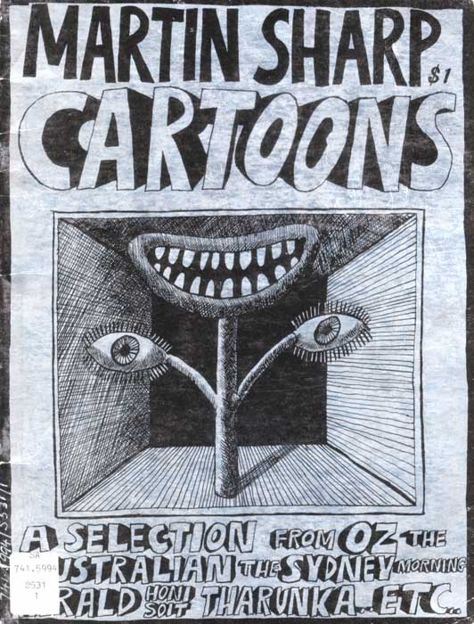
Martin Sharp (1942-2013) was born in Sydney, Australia during the Second World War. The only son of a relatively well-to-do family, he began drawing from an early age and was a fan of collage as developed by Dada, Surrealist and Expressionist artists during the 1920s and 1930s, most notably the German Max Ernst. Blowing in the Mind came at the end of a decade of practice during which Sharp refined his skills in drawing, cartooning and poster and magazine graphic design. He began sketching, painting and working with collage early in life, especially encouraged by a mother who was an amateur artist and herself worked in this manner. At Cranbrook School during the 1950s his art teacher and mentor was Justin O’Brien, a famous Australian artist well known for his brightly coloured, religious-themed works which paid due homage to the Renaissance period (Sharp, 2006). During the early 1960s Sharp attended the National Art School at East Sydney Technical College. He also undertook a year of an architecture degree at the University of Sydney. By the end of 1964 he had gained experience working as a cartoonist and graphic designer for newspapers The Australian and Sydney Morning Herald, the weekly journal The Bulletin, university student magazines Honi Soit and Tharunka, National Art School student newspaper The Arty Wild Oat, and the Sydney edition of OZ magazine, which he co-editor with friends Richard Neville and Richard Walsh. Sharp had also prepared set designs and promotional material for a number of local stage productions, and starred in a couple of underground films directed by his friend Garry Shead, including Ding a Ding Day with Richard Neville.
Sharp was heavily influenced by a love of music and a deep and ongoing interest in the history of art. He possessed a streak of Australian larrikinism which was reflected in the humour and counter-cultural, anti-establishment stance of his work. He not only drew, but also added text to many of his works as an extension of his practice as a cartoonist. Keen to observe and engage with events around him, Sharp steered clear of alcohol - the drug of choice for the male population of his native Australia – and for a brief period during the late sixties opened himself up to the effects of then-popular hallucinogenic drugs. A subsequent transformation in his art was noticeable, if short-lived. Sharp’s critical view of the world around him and satirical wit - so much a part of any good cartoonist's toolkit - saw the flowering of a unique artistic vision during a period of societal upheaval and cultural revolution throughout Australasia, the Americas and Europe in the sixties, following on the deep-seated conservatism of the post-war years. Spurred on by the arrival of a rebellious rock and roll at the end of the fifties, and the phenomena of The Beatles and Bob Dylan in 1962, it was an exciting time to be young, talented and rich. Sharp did not hold back, either in Australia or later in Asia and Europe. He enjoyed the company of people – especially women – and his talent, open personality, and humour likewise drew them to him.
Blowing in the Mind is just one example of Sharp’s somewhat frenetic output between 1966-8, whilst resident in London (Neville, 1995). For a time his art was psychedelic, informed by an explosion of colour in art, fashion and graphic design, alongside London's place as a mecca for the rapid changes in popular music. He was a pioneer of this new style of pop poster art, alongside a coterie of British, European, Asian and San Francisco poster artists such as Victor Moscoso, Jenny Maclean, Lee Conklin, Rick Griffin and Stanley Mouse, and the crazed cartooning of Robert Crumb. But, as Sharp noted in an interview for the book Electrical Banana: Masters of Psychedelic Art, psychedelia was not something artificial or commercially driven; neither was it taken up by him with any real thought or direction. It just happened, and he did it.
Since childhood I have always been an artist. "Psychedelic" was the style of the day amongst the youth in America and England, like "Cubism" in its day, or "Pop Art". I did some "psychedelic" painting for my first gallery exhibition in Sydney in 1965. ... I hadn't even heard of the word, nor had a trip, nor smoked a joint. The style was in the air, it preceded the experiences which were to follow in Bangkok and London. I had a few trips in London ... the first when I saw the [Pink] Floyd at U.F.O. Of course it was an eye opener: another dimension of reality was revealed. I attempted to express that within my art. I didn't draw under its influence. I don't believe one can. Worthwhile art takes a lot of discipline. (Martin Sharp quoted in Hathaway and Nadel, 2010).
His drawings - electric, eclectic, acid, cynical and mystic - have a staggering intensity put over in an almost insultingly casual style (Keen & La Rue, 1970)
Who was Martin Sharp?
Martin Sharp (1942-2013) was born in Sydney, Australia during the Second World War. The only son of a relatively well-to-do family, he began drawing from an early age and was a fan of collage as developed by Dada, Surrealist and Expressionist artists during the 1920s and 1930s, most notably the German Max Ernst. Blowing in the Mind came at the end of a decade of practice during which Sharp refined his skills in drawing, cartooning and poster and magazine graphic design. He began sketching, painting and working with collage early in life, especially encouraged by a mother who was an amateur artist and herself worked in this manner. At Cranbrook School during the 1950s his art teacher and mentor was Justin O’Brien, a famous Australian artist well known for his brightly coloured, religious-themed works which paid due homage to the Renaissance period (Sharp, 2006). During the early 1960s Sharp attended the National Art School at East Sydney Technical College. He also undertook a year of an architecture degree at the University of Sydney. By the end of 1964 he had gained experience working as a cartoonist and graphic designer for newspapers The Australian and Sydney Morning Herald, the weekly journal The Bulletin, university student magazines Honi Soit and Tharunka, National Art School student newspaper The Arty Wild Oat, and the Sydney edition of OZ magazine, which he co-editor with friends Richard Neville and Richard Walsh. Sharp had also prepared set designs and promotional material for a number of local stage productions, and starred in a couple of underground films directed by his friend Garry Shead, including Ding a Ding Day with Richard Neville.
Sharp was heavily influenced by a love of music and a deep and ongoing interest in the history of art. He possessed a streak of Australian larrikinism which was reflected in the humour and counter-cultural, anti-establishment stance of his work. He not only drew, but also added text to many of his works as an extension of his practice as a cartoonist. Keen to observe and engage with events around him, Sharp steered clear of alcohol - the drug of choice for the male population of his native Australia – and for a brief period during the late sixties opened himself up to the effects of then-popular hallucinogenic drugs. A subsequent transformation in his art was noticeable, if short-lived. Sharp’s critical view of the world around him and satirical wit - so much a part of any good cartoonist's toolkit - saw the flowering of a unique artistic vision during a period of societal upheaval and cultural revolution throughout Australasia, the Americas and Europe in the sixties, following on the deep-seated conservatism of the post-war years. Spurred on by the arrival of a rebellious rock and roll at the end of the fifties, and the phenomena of The Beatles and Bob Dylan in 1962, it was an exciting time to be young, talented and rich. Sharp did not hold back, either in Australia or later in Asia and Europe. He enjoyed the company of people – especially women – and his talent, open personality, and humour likewise drew them to him.
Blowing in the Mind is just one example of Sharp’s somewhat frenetic output between 1966-8, whilst resident in London (Neville, 1995). For a time his art was psychedelic, informed by an explosion of colour in art, fashion and graphic design, alongside London's place as a mecca for the rapid changes in popular music. He was a pioneer of this new style of pop poster art, alongside a coterie of British, European, Asian and San Francisco poster artists such as Victor Moscoso, Jenny Maclean, Lee Conklin, Rick Griffin and Stanley Mouse, and the crazed cartooning of Robert Crumb. But, as Sharp noted in an interview for the book Electrical Banana: Masters of Psychedelic Art, psychedelia was not something artificial or commercially driven; neither was it taken up by him with any real thought or direction. It just happened, and he did it.
Since childhood I have always been an artist. "Psychedelic" was the style of the day amongst the youth in America and England, like "Cubism" in its day, or "Pop Art". I did some "psychedelic" painting for my first gallery exhibition in Sydney in 1965. ... I hadn't even heard of the word, nor had a trip, nor smoked a joint. The style was in the air, it preceded the experiences which were to follow in Bangkok and London. I had a few trips in London ... the first when I saw the [Pink] Floyd at U.F.O. Of course it was an eye opener: another dimension of reality was revealed. I attempted to express that within my art. I didn't draw under its influence. I don't believe one can. Worthwhile art takes a lot of discipline. (Martin Sharp quoted in Hathaway and Nadel, 2010).

Martin Sharp, Seven Minutes to Four, oil on board, 1965. This landmark work prefigures the psychedelic movement to come.
In London Sharp primarily sought to be influenced, rather than influencing, and focused on engaging with
the energy of the times and enjoying himself away from the stifling constraints
of a conservative and corrupted hometown Sydney. Exposing its dark intellectual
and political underbelly through his co-editorship of OZ magazine
between 1963-66, Sharp was keen to develop his art and leave behind the
controversy and court cases generated by its content. In February 1966 he and
co-editor Richard Neville headed off for London, via South East Asia and the so-called Hippie Trail. They
followed in the wake of a host of fellow Australian artists, writers,
performers and students, including Neville's sister Julie and Sharp's friends Colin Lanceley, Brett Whiteley and Robert Whitaker, all of whom took up residence in or around London and had an effect on the evolving cultural landscape (Alomes, 1999).
Anthea Gunn, in her article A-changin’ times: the art of Martin Sharp in the 1960s (Gunn, 2010), suggests that instead of seeking direction from the European old masters – as most expatriate Australian artists did at the time - Sharp was primarily engaged with contemporary popular culture and the counterculture of London in the 1960s. This is only partly true, for the ‘old masters’ Sharp sought out were mostly from the Modern era, or still living. He was under the spell of artists such as Vincent van Gogh, Rene Magritte, Max Ernst and Georgio de Chirico. They and their ilke were the modern masters of Expressionism, Surrealism and collage, not stodgy Royal Academicians. Sharp was also a fan of El Greco and paid homage to Michelangelo in his 1968 poster Live Give Love. But art was not the only thing on the young Australian's mind - sex and drugs and rock and roll were also in the air.
Sharp and Dylan
Blowing in the Mind was not the first time Martin Sharp featured Bob Dylan in his art. A fan since initially hearing him in 1964, he had drawn Dylan whilst in Australia. During a 1979 interview with Surrealist James Gleeson he refers to a work on one of his favourite songs, Mr Tambourine Man, which was shown in his first one man exhibition Art for Mart's Sake held at the Clune Gallery, Sydney during 1965. The Clune Gallery was later the site of the famous Yellow House, set up as an artists’ venue by Sharp upon his return to Australia in 1970. It has also been noted that whether at work in his London studio, or at play, Sharp would have music blaring out from his record player, with Dylan a feature of the playlist. Sharp's attraction to the works of Bob Dylan foreshadowed his later fascination with the American songsmith and troubadour Tiny Tim. He produced a full-page drawing featuring Dylan in 1966 for Craig McGregor's book People, Politics and Pop: Australia in the Sixties (Ure Smith, 1968).

Martin Sharp, Bobby Dylan, 1966 (McGregor, 1968, 161).
The portrait of Dylan is taken from a famous photograph by W. Eugene Smith which was used on the cover of the singer's book of poetry Tarantula (1966).

The McGregor Dylan is evidence of the evolution in Sharp's style and may have been completed during his journey to London or in the early days of his residence there. It was nevertheless of foretaste of things to come. The black and while drawing contains elements which would later appear in Blowing in the Mind - the full face stare of the curly headed and bespectacled singer; the small, concentric circles floating around the middle and lower sections of the drawing; and 3D lyrics from Dylan's songs. This somewhat busy and cartoonish drawing from 1966, containing as it does elements of collage, is a less mature work than the graphically intense and stylised multi-coloured poster which would appear on the streets of London during the second half of 1967. The singer-songwriter’s head also popped up in a separate drawing in People, Politics and Pop, though this time the subject was the folk singing trio Peter, Paul and Mary and Dylan was incidental.
Martin Sharp's journey to England via Singapore, Bangkok and Nepal between February and June 1966 was to have a profound influence on his art. It was not only what he saw - such as the ancient temples of Ankor in Cambodia - but his experiences with drugs as he and Richard Neville traveled along the Hippie trail. His black and white drawings as seen in Sydney OZ magazine, for example, were simpler, and the elements more linear than the visually intense and complex works which began to appear after his arrival in London. Those works were to feature more collage elements, sinuous lines, curves, bubbles, stars, fluidity and circles. They were psychedelic.
Bob Dylan, Tarantula, The Macmillan Company, 1966.
The McGregor Dylan is evidence of the evolution in Sharp's style and may have been completed during his journey to London or in the early days of his residence there. It was nevertheless of foretaste of things to come. The black and while drawing contains elements which would later appear in Blowing in the Mind - the full face stare of the curly headed and bespectacled singer; the small, concentric circles floating around the middle and lower sections of the drawing; and 3D lyrics from Dylan's songs. This somewhat busy and cartoonish drawing from 1966, containing as it does elements of collage, is a less mature work than the graphically intense and stylised multi-coloured poster which would appear on the streets of London during the second half of 1967. The singer-songwriter’s head also popped up in a separate drawing in People, Politics and Pop, though this time the subject was the folk singing trio Peter, Paul and Mary and Dylan was incidental.
Martin Sharp's journey to England via Singapore, Bangkok and Nepal between February and June 1966 was to have a profound influence on his art. It was not only what he saw - such as the ancient temples of Ankor in Cambodia - but his experiences with drugs as he and Richard Neville traveled along the Hippie trail. His black and white drawings as seen in Sydney OZ magazine, for example, were simpler, and the elements more linear than the visually intense and complex works which began to appear after his arrival in London. Those works were to feature more collage elements, sinuous lines, curves, bubbles, stars, fluidity and circles. They were psychedelic.
A drawing with Eija
The original artwork for the Blowing in the Mind poster was executed by Sharp sometime during the latter part of 1966 and early 1967 whilst he was resident at The Pheasantry in London. It was transformed into a poster during the middle of 1967 when Peter Ledeboer, a friend of Sharp's and distributor of OZ magazine, began working with him on posters for OZ and public events. At various points Sharp refers to Blowing in the Mind as the first poster done whilst in England, though this obviously refers to the preparation of the drawing and design rather than the eventual printing. Other posters lay claim to being the first printed. For example, around January 1967 he produced the artwork for an Aubrey Beardsley themed poster announcing the sale of the first edition of London OZ magazine. The first three issues of OZ magazine also included smaller posters as inserts. Then in June he worked with Peter Ledeboer on a number of promotional posters for OZ magazine number 4 and a Legalise Cannabis rally held in Hyde Park on 16 July. It is unclear whether the January 1967 London OZ is a New Magazine! poster was printed in any large quantity, though the other posters were legitimate and must be counted, along with Blowing in the Mind, as his earliest printed English posters. Of course by this stage - the middle of 1967 - Sharp was producing a large amount of art for London OZ magazine and heavily involved in its production. It was only once that work slowed down that he turned his attention to large posters for public display and sale.
In regards to the original, full size artwork for Blowing in the Wind, its creation took place around the time that
Sharp was experiencing the effects of hallucinogenic drugs, in situations such as the Pink Floyd
concert at London's UFO club around Christmas / New Year 1966-7 where he had his first acid trip. Pink Floyd were
one of England’s earliest and most prominent psychedelic bands, with an
accompanying light show which sought to enhance the effect of drugs such as LSD and marijuana, as had been pioneered in American music venues such as the Avalon Ballroom and the Fillmore Auditorium, both in San Francisco.
They appeared at the UFO between 23 December 1966 and regularly through to July 1967. In recalling his work with Big O in 1967, and the creation of both the Dylan Blowing in the Mind and the Donovan Sunshine Superman posters, Sharp noted:
I was painting pop
art in Sydney before I left Australia. The Donovan piece was a tribute poster,
which I did as an admirer of his songs. There was a photograph central to that,
and then I cut up some old Sketch magazines for the theatrical figures around
the edges. The artwork was done at actual size, and I just started off and
followed my nose, really. I would often work on Kromekote so you could scratch
off mistakes, but often my mistakes led to my effects, because I’d accidentally
drop spots of ink in my drawings. I’d leave ink blots and work around them. The
same for the Dylan poster; Eija, my dear Finnish girlfriend, helped me with all
those circles on the Dylan piece which was the very first of that series… I
adored the song “Mister Tambourine Man”. In London I had a wonderful printer,
Peter Ledeboer, who was printing OZ. He loved the idea of doing posters; he was
a great publisher for me. And I really loved the effects of foil, so we printed
on foil stock. I admired the San Francisco poster artists, Mouse, Moscoso,
Rick Griffin … Zap … Robert Crumb was, and is, the maestro of Underground comics. (Martin Sharp quoted in Hathaway and Nadel
2010).
Sharp also recalled that the Dylan poster was drawn at
the Joubert Studio, London, which was, at the time, rented by fellow Australian
and friend, Robert “Bob” Whitaker, the photographer to The Beatles. Sharp was put up
temporarily in the kitchen at Joubert upon arrival in England. A London friend David Litvinoff later suggested he move next
door to a large studio in The Pheasantry, on King's Road. He was joined there
by Australian filmmaker Philippe Mora and his girlfriend, and later the
British guitarist Eric Clapton moved in with his girlfriend. According to Sharp,
he completed the art for Blowing in the
Mind at the Pheasantry, assisted by his then-time girlfriend, Finnish model Eija Vehka-aho. In an interview
in 2002 for the National Gallery of Australia, he noted:
This poster is one of my first published works after my arrival in London in 1966. I can remember my dear friend Eija Vehka-aho creating all the beautiful circles that make up Bob Dylan’s hair and which contribute so much to the work. The photograph, which forms the main image, was enlarged from a small photo in a book. The central image in the hair is a knot design, possibly by Leonardo da Vinci. Aubrey Beardsley’s work was enjoying a revival at the time and there were many posters being produced from many sources and periods, as well as by the young artists of the day. There is certainly a Beardsley flavour. The lettering is by me and all these elements were collaged together to make the complete image. Bob Dylan’s Mister Tambourine Man was a favourite song of mine. My poster is really just a tribute to Bob Dylan, a songwriter and singer I have greatly admired since first hearing him in 1964. The poster was printed by Peter Ledeboer, who was the printer of OZ Magazine, and he also distributed it to the numerous poster shops and stalls. It was sold for £1, in an unlimited edition, and was very much a part of the times in London in the late 1960s: a decoration. (Martin Sharp quoted in Gray, 2002).
This poster is one of my first published works after my arrival in London in 1966. I can remember my dear friend Eija Vehka-aho creating all the beautiful circles that make up Bob Dylan’s hair and which contribute so much to the work. The photograph, which forms the main image, was enlarged from a small photo in a book. The central image in the hair is a knot design, possibly by Leonardo da Vinci. Aubrey Beardsley’s work was enjoying a revival at the time and there were many posters being produced from many sources and periods, as well as by the young artists of the day. There is certainly a Beardsley flavour. The lettering is by me and all these elements were collaged together to make the complete image. Bob Dylan’s Mister Tambourine Man was a favourite song of mine. My poster is really just a tribute to Bob Dylan, a songwriter and singer I have greatly admired since first hearing him in 1964. The poster was printed by Peter Ledeboer, who was the printer of OZ Magazine, and he also distributed it to the numerous poster shops and stalls. It was sold for £1, in an unlimited edition, and was very much a part of the times in London in the late 1960s: a decoration. (Martin Sharp quoted in Gray, 2002).

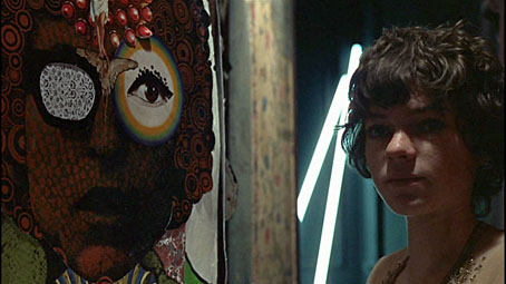
Eija Vehka-aho and Susan Bottomly in a photograph by Guy Bourdin for French Vogue magazine, 1972.
In correspondence with this author during May 2015, Eija Vehka-aho made the following comments in regards to her work on the poster:
Thank you for acquainting me with your most informative Dylan poster story. I didn’t know the poster was so famous.... My association with Martin and the poster was that I was his then-time girlfriend. I was only giving a helping hand, I guess because I could be neat (not accident prone with the ink bottle) and had plenty of patience, also maybe doing all the circles would have been a bit tedious for Martin. I remember drawing the circles on the floor with a pair of compasses, not in Jubilee Place but in the Pheasantry.

Pants suit, New York, 1968.
Sharp had commented that he sometimes spilt ink when drawing, but, in the instance of the Sunshine Superman poster, he left them there and claimed that they added to the work. The original photograph Sharp used as the basis for the central image of the Dylan poster was most likely that taken by Daniel Kramer during 1965, around the period of the Bringing it all on home recording sessions and subsequent live performances whereby Dylan went electric and hooked up with The Band. The central image in the poster appears to be from a photograph of Dylan in August 1965 during a rehearsal for an historic concert at the Forest Hills Stadium, New York.

Daniel Kramer (photographer), Bob Dylan at Forest Hills Tennis Stadium, Queens, New York, 28 August 1965.
In this photograph we see the frizzy, curly hair, large dark-rimmed glasses and the youngish features of the artist as he stares directly at the photographer. Sharp blows up this deadset stare and it becomes the unmissable focus of the poster. The small image of Dylan at the bottom centre of the poster appears to be from the Bringing it all back home sessions, though the precise photograph has not been located. The one illustrated below is the closest so far identified. It is similar in that both images show Dylan wearing a harmonica and with his head tilted as he sings into a microphone. In the poster image he is smiling.

Daniel Kramer (photographer), Bob Dylan, Bringing it all back home session, 1965.
Anthea Gunn, in her 2010 description of the poster, suggested that Sharp had ‘transformed Dylan’s curls to a psychedelic pattern of circles emanating from a mandala, drawing on the interest in drugs and Eastern spirituality that characterised the counterculture of the sixties’ (Gunn, 2010). The mandala was based on a Leonardo da Vinci drawing, though Sharp is a bit vague about its origins. His 1979 interview with James Gleeson also includes reference to the poster and the process of its creation:
...I haven't ever really printed any of my own works... Some were done in London. I just would suggest the silver paper and do the artwork and suggest the way it should be printed. Like the Bob Dylan one... The Bob Dylan one was, I think, the second poster I had printed, apart from one of the Art Student's Ball in Sydney [1962]... Mr Tambourine Man was a song which I actually painted and I was very inspired by it. It's a rather carnival song and I painted this for my first exhibition ... To a particular record. It was my musical accompaniment, so to speak. I suppose I'd always admired him and there came a chance. The publisher of OZ in London was interested in doing posters, so I started. This was a collage, a blow up of a photograph... This is some of Leonardo's knot work, I think... These were done, some by me, but made by a very patient friend with a compass. This was in the psychedelic period when everyone was sort of coming under the influence of drugs, marijuana and things like this, and very prevalent in London at the time. (Martin Sharp quoted in Gleeson, 1979)
Blowing in the Mind is, as Anthea Gunn
suggests, one of Sharp’s ‘densely populated works that appealed to the tuned in
mind’ (Gunn, 2010). In its production it was affected by hallucinogenic drugs, and similarly a viewing affects those on drugs or
having used drugs. The design is very much of its time. The ‘Beardsley flavour’
Sharp refers to is only evident in close scrutiny of the detail, with swirls
and intersecting lines almost hidden amongst Eija’s mass of circles and the face of Dylan.

The Poster
Encouraged by the success of the OZ-related posters during the first half of 1967, and newly attuned to the fact that there were a growing market for pop culture posters, both in direct sale and via mail order, Peter Ledeboer in September 1967 set up the firm Big O Posters of London (Suckling 2014). Blowing in the Mind was one of the first Big O posters – if not THE first – and subsequently allocated the number BOP1 in the company’s sale catalogues and advertisements. The precise date of the initial printing is unknown, but most likely occurred around July-September 1967, shortly after Sharp's Legalise Cannabis and OZ Number Four posters were completed. Sharp had originally wanted the Dylan poster to be printed in purple and black on silver foil, but the printer decided to use red and black on gold.
The Observer Magazine, London, 3 December 1967, 13. Front page to article by George Melly.
The Poster
Encouraged by the success of the OZ-related posters during the first half of 1967, and newly attuned to the fact that there were a growing market for pop culture posters, both in direct sale and via mail order, Peter Ledeboer in September 1967 set up the firm Big O Posters of London (Suckling 2014). Blowing in the Mind was one of the first Big O posters – if not THE first – and subsequently allocated the number BOP1 in the company’s sale catalogues and advertisements. The precise date of the initial printing is unknown, but most likely occurred around July-September 1967, shortly after Sharp's Legalise Cannabis and OZ Number Four posters were completed. Sharp had originally wanted the Dylan poster to be printed in purple and black on silver foil, but the printer decided to use red and black on gold.

Martin Sharp, Blowing in the Mind, Big O posters, London, 1967. Printer's proof. Offset lithograph in purple and black ink on silver metallic-faced card, 20 x 30 inches.
A proof copy in red and black on silver foil is
also known. This untrimmed copy contains borders on three sides and an extension of the image on the right side. The inking of the poster is rough, with some areas omitted.


Upon viewing the red and gold version, Sharp went along with the printer's recommendation. In 2013 a rare copy of a purple proof version was sold by Maggs Brothers, London (Maggs, 2013) and a copy of the silver foil version was unearthed, though the latter may also date from a later print run, perhaps when the printer was running out of gold foil card. The purple version was stunning, though one could not argue with the final colour selection. The poster was printed in red and black inks on gold metallic-faced card, a medium Sharp was especially fond of. Shape had used metallic-faced card whilst in Australia, initially on the cover of Sydney OZ magazine number 21 in August 1965, and most notably with the cover of his 1966 catalogue of cartoons (Sharp, 1966).

Martin Sharp, Blowing in the Mind, Big O posters, London, 1967. Printer's proof. Offset lithograph in red and black ink on silver metallic-faced card, 20 x 30 inches. Sold at auction in July 2015.

Upon viewing the red and gold version, Sharp went along with the printer's recommendation. In 2013 a rare copy of a purple proof version was sold by Maggs Brothers, London (Maggs, 2013) and a copy of the silver foil version was unearthed, though the latter may also date from a later print run, perhaps when the printer was running out of gold foil card. The purple version was stunning, though one could not argue with the final colour selection. The poster was printed in red and black inks on gold metallic-faced card, a medium Sharp was especially fond of. Shape had used metallic-faced card whilst in Australia, initially on the cover of Sydney OZ magazine number 21 in August 1965, and most notably with the cover of his 1966 catalogue of cartoons (Sharp, 1966).
The Blowing in the Mind poster was inscribed with the words 'SHARP' within the image at lower right. The large text at the bottom read MISTER TAMBOURINE MAN and additional text was included throughout the work comprising lines from Dylan songs, most noticeably the words Blowing in the Mind reflected in his spectacles. An absence of red ink in the lower section about the text led to an emphasis on the words MIST TA URINE MAN, which reflects Sharp’s sense of humour and the critical reception an electric Dylan received when he toured England in 1966 with The Band. Sharp was not in England at the time of the tour but arrived shortly thereafter. He would therefore have been very much aware of the reception Dylan received, and undoubtedly surprised, as a fan, by it. Sharp was not one of those who abandoned the electric Dylan. In fact, it could be said that Blowing in the Mind is a celebration of it. The poster as originally printed by Sharp and Ledeboer did not bear any inscription relating to Big O Posters or the printer's contact details, unlike subsequent works by them. This suggests that it was prepared for printing, and the first copies run off, prior to the creation of Big O in September 1967. Their Legalise Cannabis poster was likewise initially uninscribed when first printed in June-July 1967, though later printings did include the Big O name and address along the lower margin. Blowing in the Mind was initially allocated the code BOP! in a Big O advertisement which appeared in OZ magazine #9 during February 1968, though Ledeboer eventually set on BOP1 as it's catalogue number for later advertisements and through to the OZ final editions in 1973. Legalise Cannabis was allocated BO1 after being erroneously listed in OZ as BO7. The May 1968 edition of OZ featured a small illustrated ad for the poster.

Advertisement for Blowing in the Mind poster, OZ magazine #12, May 1968.
Blowing in the Mind was so popular that by February 1968 the Big O
advertisement in OZ noted that it was being
reprinted. The use of a photographically based offset lithography printing process allowed
for the almost endless reproduction of Sharp's original artwork, without any
significant loss of quality. This was unlike traditional stone lithography or
the silkscreen process, both of which could only be used for short print runs
before the image on stone or silk screen deteriorated. Copies of Blowing in
the Mind were sold through Big O outlets around the world and by mail order
through to the late seventies and the eventual demise of the firm. A poster issued with Mick Farren's 1977 book Get on Down: A Decade of Rock and Roll Posters, featured on the reverse a group of posters including Blowing in the Mind, perhaps suggestive that it was still for sale through Big O. The poster was actually reprinted in Get on Down, both in the 1976 London edition and the United States edition the following year. With that reprint on white paper the ink was laid down in the order black, red and gold to replicate, in a smaller version, the original. The majority of
the original, full-size posters found their way onto the bedroom walls of young Bob Dylan fans around the world. Their
ephemeral nature and 'cheap' production meant they were often binned after
being pinned, sticky taped or glued to walls. Furthermore, the stiff nature of
the metallic faced card resulted in creasing when rolled, and the thin foil top
layer was prone to tearing, oxidation and lifting off its base. It is possible that later printings were on thicker foil paper with no card backing, as is the case with modern reprints. Original
copies in good condition are now rare and fetch a premium when sold at auction
or through dealers. £1500 UK is a typical price for an original copy in good
condition. Bootleg copies are known, and an official reprint is available in
2014 through associates of the artist and Peter Ledeboer.
The OZ magazine cover
According to Gunn (2010), the success of the Dylan poster led Sharp to make use of it for the cover of London OZ magazine, number 7, which hit the streets in October 1967. It is also possible that the magazine cover came first, or at approximately the same time.
The OZ magazine cover
According to Gunn (2010), the success of the Dylan poster led Sharp to make use of it for the cover of London OZ magazine, number 7, which hit the streets in October 1967. It is also possible that the magazine cover came first, or at approximately the same time.

Martin Sharp, OZ magazine, number 7, October 1967. Cover illustration.
Printed in yellow and black on silver coated thick paper, it was almost identical to the poster apart from the addition of OZ related text such as the large yellow OZ logo (which included the Leonard da Vinci knot within the O), the price 2/6 instead of a circle in the top right corner, and the words OZ no7 at bottom right. The substantially black and silver illustration included a section of Dylan's face masked in yellow, with the chin uncoloured and a host of small hearts and crosses fanning out over his skin, as in the poster. Missing from this magazine version is the small profile image of Dylan singing into a microphone which was located on the bottom section of the poster. The glass sections of Dylan's spectacles are also left uncoloured and the right side and bottom edge of the original image have been trimmed to accommodate the reduced height and width of the magazine format. The lower section also includes yellow highlighting in the areas of the text Mister Tambourine Man and for some of the graphical detailing such as lines and extensions of the circles. However the text is only coloured selectively, emphasising the words MIST and URINE. It should be remembered that posters such as Blowing in the Mind, whilst popular, were not seen as fine art productions during their initial period of production in the sixties and through to the seventies. Rather, they were viewed as cheap, ephemeral productions - a mere "decoration" to quote Sharp - usually printed in large numbers and on cheap paper. They were initially produced for posting on billboards and walls in public places. However the artists and printers / publishers soon realised that people were collecting them and that there was a market for them. It was only much later that museums and art galleries began to acquire copies for preservation and display, and the poster began to feature in exhibitions dealing with the sixties, psychedelia, poster art and graphic design. Despite this, as early as December 1967 the iconic status of Blowing in the Mind was identified by British art critic and musician George Melly. In an article entitled 'Poster Power' published in the Observer colour supplement to The Times of London on 3 December, he wrote, following on a discussion of the poster work of Michael English and Nigel Waymouth operating as Haspshash and the Coloured Coat:
The other principal designer of Underground posters is the Australian artist Martin Sharp. His future in the field seems to me less in doubt because, while his work is perhaps less technically inventive than Hapshash's, his ideas are more original. ..... Sharp is connected with the magazine OZ, and while OZ is extremely sympathetic to the Underground it has a less childlike confidence in mind expansion as the whole answer to the crisis in our society. As if to confirm this analysis, Sharp's posters seem divided between a bitter political disillusion and the more agreeable if hackneyed universe of the flower children. Yet in the latter field, his 'Dylan' poster is outstanding for its richness of imagination, and if such a deliberately transitory art form as the Underground poster can produce a work of permanent interest, this could well turn out to be it. (Melly, 1967).
The Melly article was accompanied by a series of photographs depicting a group of suitably dressed young people posing on a ladder and in a mini more before a wall plastered with posters. Blowing in the Mind figures prominently in the top centre, between two works by English and Waymouth.


A report in the Sydney Morning Herald of 14 December 1967 commented on the Observer story and Sharp's poster, adding its own Australian angle:
Sharp Dylan
An Op-Psych print of singer Bob Dylan has exploded on to London's Underground scene, making Australian artist Martin Sharp king of the kinky poster makers. Sharp's green-yellow portrait of Dylan graced the cover of London OZ magazine recently and this month was reprinted in the "Observer," which hailed it as an outstanding example of poster power. The Underground has nothing to do with tube trains and railway stations. It is an intellectual movement which depends greatly on graphic art to communicate its pop-intellectual message.
Posters
The Underground poster, says the "Observer," is not so much a broadcast of information as a way of advertising a trip to an artificial paradise .... and Sharp's Dylan poster points the way to further horizons. The "Observer" feels that Sharp's posters will avoid the great flaw to this current, swirling, psychedelic, op-pop-art nouveau trend - that what shocks today will fail to attract attention tomorrow.

Members of the British psychedelic group Tomorrow admiring a group of posters, including Blowing in the Mind, 1967. Shot possibly taken in the foyer of the UFO Club, London. (Hanke and Puterbaugh, 1997). To the left of Blowing in the Mind is a poster for the band Crazy World of Arthur Brown, making use of a still from the 1921 German movie The Cabinet of Dr. Caligari; to the right are three Hapshash and the Coloured Coat posters -
Two years later, in his book Revolt into Style: the pop arts, Melly returned to his analysis of modern posters and noted somewhat disparagingly that, whilst the 'psychedelic poster moved out of the Underground and spread across the walls of almost every middle-class teenage bedroom ... a few posters, in particular Sharp's 'Dylan' and Hapshash's 'Legalize Pot Rally' have remained alive as image' (Melly, 1970). The poster had also made an appearing in a small French illustrated booklet of hippie-related posters, designs and illustrations entitled Le Livre Rose du Hippy (Muller, 1968), with quotes throughout by the likes of Timothy Leary and Alan Ginsberg.
Remake, remodel
Sharp made use of the Dylan poster image in 1968 when he worked on some of the set designs for the film Performance. Starring Mick Jagger and released in 1970, this controversial work by directors Donald Cammel and Nicholas Roeg featured a character named Pherber (Anita Pallenberg) who was an artist. Her work includes a concert poster of Jagger plus a wall collage featuring the head of Dylan from the Blowing in the Mind poster, though in this instance blown up to a much larger size. Both works were produced by Sharp.
Michele Breton and Martin Sharp collage, Performance, [filmed 1968], released 1970.
Blowing
in the Mind also featured
– twice - in the 1969 coffee table book on Australian artists, In the Making: Australian art and artists,
compiled by Craig McGregor and a group of local artists and graphic designers. The poster was integrated with another Sharp drawing from the
period proclaiming the word POP in numerous forms.


A full-page colour advertisement in the Australian Women's Weekly during 1972 presented a typical teenager's bedroom, with Blowing in the Mind hanging on the wall alongside a poster for the cult movie Easy Rider.

Blowing in the Mind is almost an obligatory feature in any discussion on the topic of psychedelic posters and the art of the Underground or counter-culture. It was illustrated and discussed in Mick Farren’s Get on Down! A Decade of Rock and Roll Posters (1976), and Ted Owen’s High Art: a history of the psychedelic poster (1978), one of the earliest such studies. The poster features on the cover of Elizabeth Nelson’s The British Counter-Culture, 1966-73: A Study of the Underground Press (1989) and also in the exhibition and catalogue for the Tate Gallery travelling exhibition Summer of Love: Art of the Psychedelic Era (Grunberg, 2005). More recently Murray Walding and Nick Vukovic’s Plastered: the Poster Art of Australian Popular Music (2005) and Mike Evan’s The Art of British Rock: 50 years of rock posters, flyers and handbills (2010) bring Blowing in the Mind together with a host of other music and event posters from the period, revealing not only the historical context but the richness and variety of works in this field. The occasional academic article, alongside numerous websites and blogs continue this theme, listing the poster and discussing elements of its design and the life of the artist (Colthart 2013; Gunn, 2010; Howard, 2012; Poyner, 2013). Detailed descriptions of the poster are also to be found in the online catalogues of museum, galleries and libraries such as the Australian National Gallery, Canberra; the Victoria and Albert Museum, London; the Museum of Modern Art, New York; and the Powerhouse Museum and State Library of New South Wales, Sydney. The poster has also been subject to a remake / remodel at the hands of American poster artist Chuck Sperry, who used it as the basis for a 2010 Bob Dylan concert poster.
Martin Sharp, Bob Dylan / Pop, collage in Craig McGregor (ed.), In the Making, 1969.
The collage is composed of the Blowing in the Mind poster from 1967 and the right half of a Sharp pen drawing which forms the back cover of Peter Draffin's novel Pop, published in Sydney 1967 but featuring artwork produced by Sharp the previous year. A small version of the poster appeared in the Headopoly poster included with Richard Neville's 1970 book Play Power - Exploring the International Undergound. It is therein underlain by a cartoon of marijuana leaves.
Headopoly Game poster [extract], Play Power, 1970.
A full-page colour advertisement in the Australian Women's Weekly during 1972 presented a typical teenager's bedroom, with Blowing in the Mind hanging on the wall alongside a poster for the cult movie Easy Rider.
Advertisement, Australian Women's Weekly, 1972. Note the Blowing in the Mind poster on the wall in the background, next to a poster from the movie Easy Rider.
Blowing in the Mind is almost an obligatory feature in any discussion on the topic of psychedelic posters and the art of the Underground or counter-culture. It was illustrated and discussed in Mick Farren’s Get on Down! A Decade of Rock and Roll Posters (1976), and Ted Owen’s High Art: a history of the psychedelic poster (1978), one of the earliest such studies. The poster features on the cover of Elizabeth Nelson’s The British Counter-Culture, 1966-73: A Study of the Underground Press (1989) and also in the exhibition and catalogue for the Tate Gallery travelling exhibition Summer of Love: Art of the Psychedelic Era (Grunberg, 2005). More recently Murray Walding and Nick Vukovic’s Plastered: the Poster Art of Australian Popular Music (2005) and Mike Evan’s The Art of British Rock: 50 years of rock posters, flyers and handbills (2010) bring Blowing in the Mind together with a host of other music and event posters from the period, revealing not only the historical context but the richness and variety of works in this field. The occasional academic article, alongside numerous websites and blogs continue this theme, listing the poster and discussing elements of its design and the life of the artist (Colthart 2013; Gunn, 2010; Howard, 2012; Poyner, 2013). Detailed descriptions of the poster are also to be found in the online catalogues of museum, galleries and libraries such as the Australian National Gallery, Canberra; the Victoria and Albert Museum, London; the Museum of Modern Art, New York; and the Powerhouse Museum and State Library of New South Wales, Sydney. The poster has also been subject to a remake / remodel at the hands of American poster artist Chuck Sperry, who used it as the basis for a 2010 Bob Dylan concert poster.

Chuck Sperry, Bob Dylan and his band, The Warfield, San Francisco, 25 August 2010. Silkscreen print, in nine colours, 23 x 35 inches. Limited edition of 25 on gold foil and 150 on archival cream paper. Includes elements of the original Blowing in the Mind poster, notably the circles and red on gold colouring. See here for images of the printing process.
The Foggy copy
An interesting story is told by Roger Fogg, a kinetic light show artist and close friend of Sharp's. At one point during the 1990s Roger and his young daughter visited Sharp at his house Wirian in Sydney, with the aim of getting him to autograph their copy of Blowing in the Mind. Whilst Roger and Martin were talking, the need to occupy the young girl arose. Roger suggested to her that she try to see if there were any two circles on the poster that were the same. This worked a treat and for a period she remained intently focussed on the work. She eventually came back to Roger and Martin with the comment, "I have found 2 circles that are the same - here and here..." Sharp subsequently signed and annotated the poster, and also added two new circles to the print, enhancing its uniqueness and perhaps bringing to an end his work featuring Bob Dylan.
Coda
Before he died in January 2013 Martin Sharp passed his last remaining original copy of Blowing in the Mind on to Bob Dylan. This apparently took place whilst the singer was in Sydney for a concert performance, though the precise date and circumstances are not known. And in an interview published in a Sydney newspaper 6 months prior to his death, the author noted:
Sharp doubts he'll get around to reworking his Dylan image, although he'd like to fix the lettering so "Mr Tambourine Man" can't be misread as "Mr Urine Man" (Morgan 2012).
Martin Sharp's Blowing in the Mind and Milton Glasner's Bob Dylan, 1967. Display at the Museum of Modern Art, New York, January 2015.Photograph: Noel Broadhead.
Alomes, Stephen, When London Calls: The Expatriation of Australian Creative Artists to Britain, Cambridge University Press, 1999, 320p.
Anonymous, Sharp Dylan, Sydney Morning Herald, 14 December 1967.
Anonymous, Sharp Dylan, Sydney Morning Herald, 14 December 1967.
Bigham, Julia, Day-Glo Mind Blow, Eye: The
International Magazine of Graphic Design, volume 11, number 42, 2001,
32-43.
Coulthart, John, Martin Sharp, 1942-2013 [blog], 2 December 2013. Available URL: http://www.johncoulthart.com/feuilleton/2013/12/02/martin-sharp-1942-2013/.
Desmond, Michael and Dixon, Christine, 1968, National Gallery of Australia, Canberra, 96p. Catalogue of an exhibition held between 29 July - 29 October 1995.
Evans, Mike, The Art of British Rock: 50 years of rock posters, flyers and handbills, Frances Lincoln, London, 2010. Illustrated page 67.
Farren, Mick, Get on Down! A Decade of Rock and Roll Posters, Futura Publications Ltd. and Demsey & Squires, London, 1976, 96p; Big O Publishing Ltd., London and Charlottesville, Virginia, 1977, 96p.
Gleeson, James, Interview with Martin Sharp, National Gallery of Australia, 1979, 90m 43s. Audio plus transcript. Available URL: http://nga.gov.au/Research/Gleeson/pdf/Sharp.pdf.
Gray, Anne (ed.), Martin Sharp - Mister Tambourine Man, Australian art in the National Gallery of Australia, National Gallery of Australia, Canberra, 2002.
Green, Days in the Life, and All Dressed Up: The
Sixties and the Counter-culture, Random House, London, 1999.
Greer, Germaine, Want to know what the 60s were
like? Then look at Martin Sharp’s work, The
Guardian, 22 November 2009.
Grunberg, Christopher, ed., Summer of Love: Art of the Psychedelic Era, Tate Gallery, London, 2005, 239p.
Gunn, Anthea, A-changin' times: the art of Martin Sharp in the 60s, Journal of Australian Studies, 34(2), June 2010, 179-93.
Hanke, James and Puterbaugh,Parke (ed.), I want to take you higher: the psychedelic era 1965-1969, The Rock and Roll Hall of Fame Museum, Chronicle Books, 1997.
Hathaway, Norman and Nadel, Dan, Electrical Banana: Masters of Psychedelic Art, 2002.June 2010, 179-93.
Hill, Jonathan, The world of psychedelic artist John Hurford, Sunrise Press, 2014.
Howard, Peter, Sixties Bob Dylan poster of psychedelic foil by Martin Sharp, Poster Central [blog + video], 23 April 2012. Available URL: http://blog.postercentral.com/2012/04/23/bob-dylan-donovan-psychedelic-foil-wall-posters-by-martin-sharp/.
Keen, Graham, and La Rue, Michael, Underground Graphics, Academy Editions, London, 1970, 80p.
Kramer, Daniel and Stephenson, Sam, Bob Dylan and W. Eugene Smith, Jazz Loft Project Blog, available URL: http://www.jazzloftproject.org/blog/uncategorized/daniel-kramer-bob-dylan-and-w-eugene-smith. Accessed 15 October 2014.
Maggs Brothers, For the World's End: Selections from Jonathan Gill's flatter stuff, Catalogue 1465, Maggs Counterculture, Maggs, London, 2013. Auction sale catalogue. Illustrated cat. nos 33-34.
McGregor, Craig, People, Politics and Pop: Australians in the Sixties, Ure Smith, Sydney, 1968, 221p. Illustrated by Martin Sharp.
Melly, George and Patrick Ward, Poster Power, Observer Colour Supplement, The Times, 3 December 1967.
-----, Revolt into Style: the pop arts, Anchor Books, 1971.
Morgan, Joyce, Interview: Martin Sharp, Sydney Morning Herald, 2 June 2012.
Muller, Paul, Le Livre Rose du Hippy, Union Generale Editions, Paris, 1968.
Nelson, Elizabeth, The British Counter-Culture, 1966-73: A Study of the Underground Press, Macmillan, 1989, 182p.
Neville, Richard, Hippie Hippie Shake: the dreams, the trips, the trials, the love ins, the screw ups, the sixties, William Heinmann, Melbourne, 1995.
Neville, Richard, Walsh, Richard, and Sharp, Martin
(editors), OZ: satirical magazine,
Sydney, 1963-1968.
Owen, Ted, High Art: a history of the psychedelic poster, Sanctuary Publishing, 1978, 176p. Illustrated page 140.
Poyner, Rick, Martin Sharp: From Satire to Psychedelia, Observatory: Design and Visual Culture [blog], 12 December 2013. Accessed 26 January 2014. URL: http://observatory.designobserver.com/feature/martin-sharp-from-satire-to-psychedelia/38242/.
Psychedelic Posters of the 1960s [website], accessed 21 January 2014.
Sharp, Martin, Cartoons, Scripts, Sydney, 1966.
-----, Martin Sharp Limited Edition Posters [website], Evermore Productions, Stroud, 2004, available URL: http://www.martin-sharp.com/.
-----, Mister tambourine man...Blowing in the mind 1968 [webpage], National Gallery of Australia, available URL: http://artsearch.nga.gov.au/Detail.cfm?IRN=80851.
-----, The Everlasting World of Martin Sharp: Paintings from 1948 to today, Ivan Dougherty Gallery, Sydney, 2006.
-----, Blowing in the Mind poster, in The Great Refusal, Protesting 1948-84 exhibition, Hayward Gallery, London, November 2013. Video here: http://vimeo.com/77061467.
Walding, Murray and Vukovic, Nick, Plastered: The Poster Art of Australian Popular Music, The Miegunyah Press, Carlton, 2005.
Whiteley, Gillian, Revisiting Psychedelia: Summer of Love, Psychedelic Art, Social Crisis and Counterculture in the Sixties [review], The Art Book, 14(2), November 2007, 15.
Blowing in the Mind 1967 | Brett Whiteley | Don't Look Back 1967 | London 1962 | Masters of War
Michael Organ
Last updated: 17 July 2015
Last updated: 17 July 2015
that's great Michael
ReplyDeletethe sort of poster my elder sisters had on their bedroom walls
Very nicely done. The Eija connection, too. She was a top model - a muse for Helmut Newton and for Lagerfeld. Disappeared without a trace in later life, although Martin apparently stayed in touch. I have a letter from him from 2007 referring to his "dear Finnish girlfriend" and her then whereabouts.
ReplyDeleteThanks for that. Yes, Eija is a mystery - I scanned the internet and other sources for any reference, I even emailed someone with her name in Finland, but no response. If you would care to pass the information on I would be happy to include it in the blog for the record. Michael
DeleteHi Michael,
ReplyDeleteI have a Poster in gold and black how do I know it´s an original and what is the value of it?
Kr Mia
This comment has been removed by the author.
DeleteAbout a certain caption!
ReplyDelete"Poster Power, Observer, 10 December 1967. Photographs: Patrick Ward. Note the Blowing in the Mind poster near the top of the wall, in between two Hapshash and the Coloured Coat posters - on the left Julie Felix at the Royal Albert Hall, 1969, and to the right UFO mk2."
The actual date for the Observer piece is 3rd December 1967